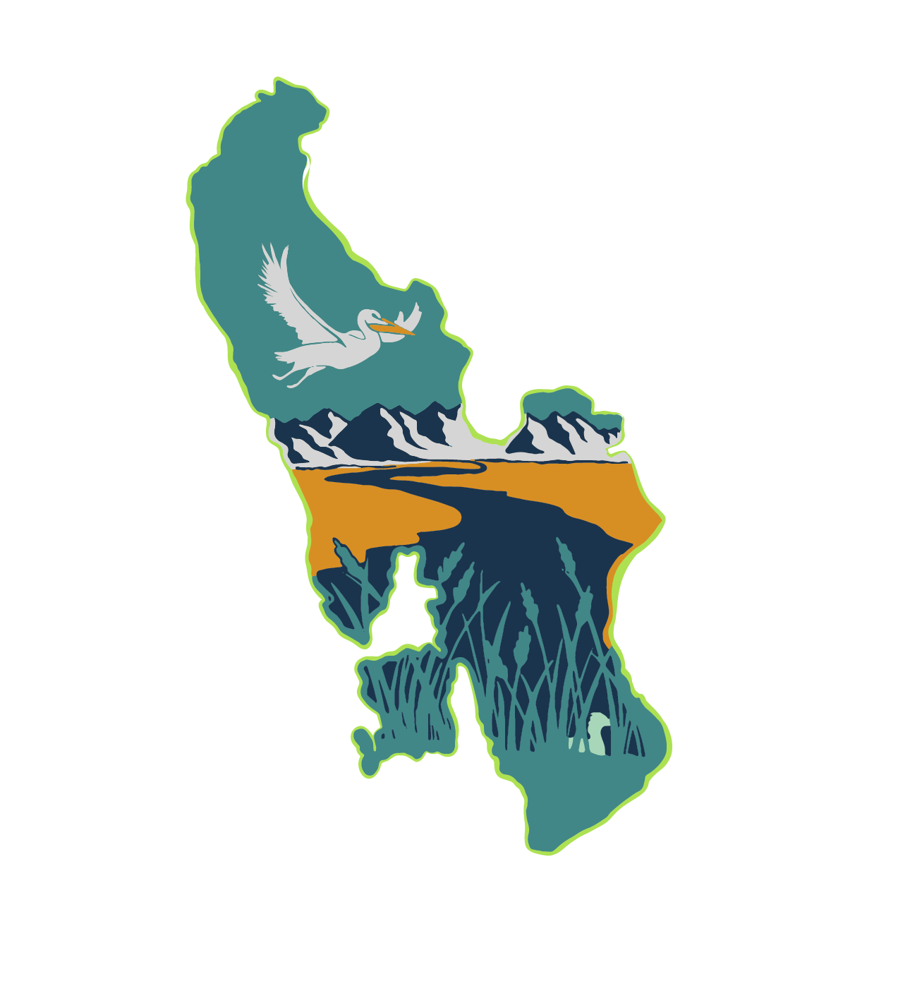
Elements in the original design concept
When I designed the logo concept for the Great Salt Lake Waterkeeper, I wanted to reflect the mission to restore the lake, while celebrating the beauty of the ecosystem. Here’s what I included in this concept:
The arrow: The arrow on the center left symbolizes the goal of raising the lake’s water level to 4,200’. I tucked it into the Wasatch Mountains, blending it into the peaks to show how the mission is rooted in the region and to make it feel like part of the Great Salt Lake landscape.
Changing water flow: The river’s color changes as it reaches the line that signifies the current water level.
Wetland wildlife: As an Easter egg, I hid a grebes nestled in the grasses, and show an American White Pelican flying off.
Rising Water Lines: Behind the “Rise Up” text, the lines symbolize the rising water levels, reinforcing the heart of the mission.
I wanted this logo to feel purposeful and full of meaning - something that tells the story of the Great Salt Lake Waterkeeper’s fight for a healthier, fuller lake.

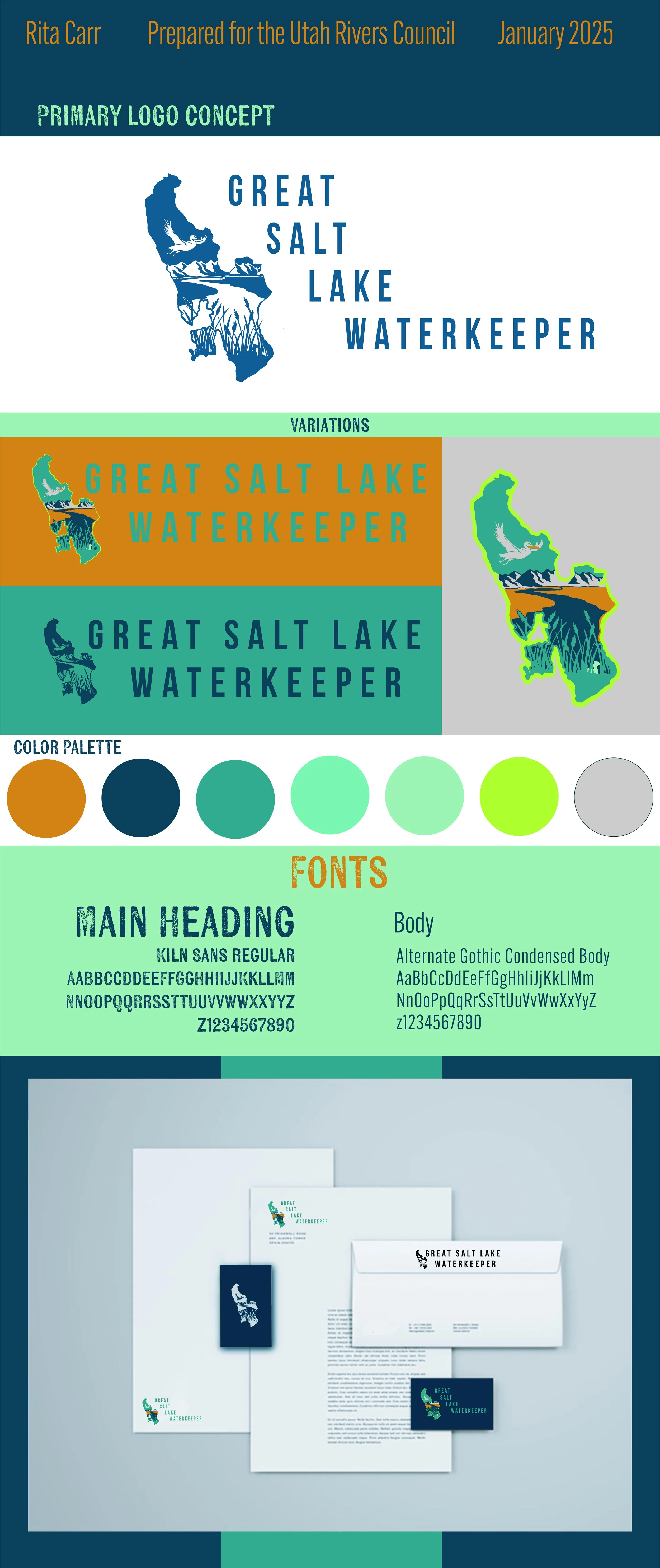
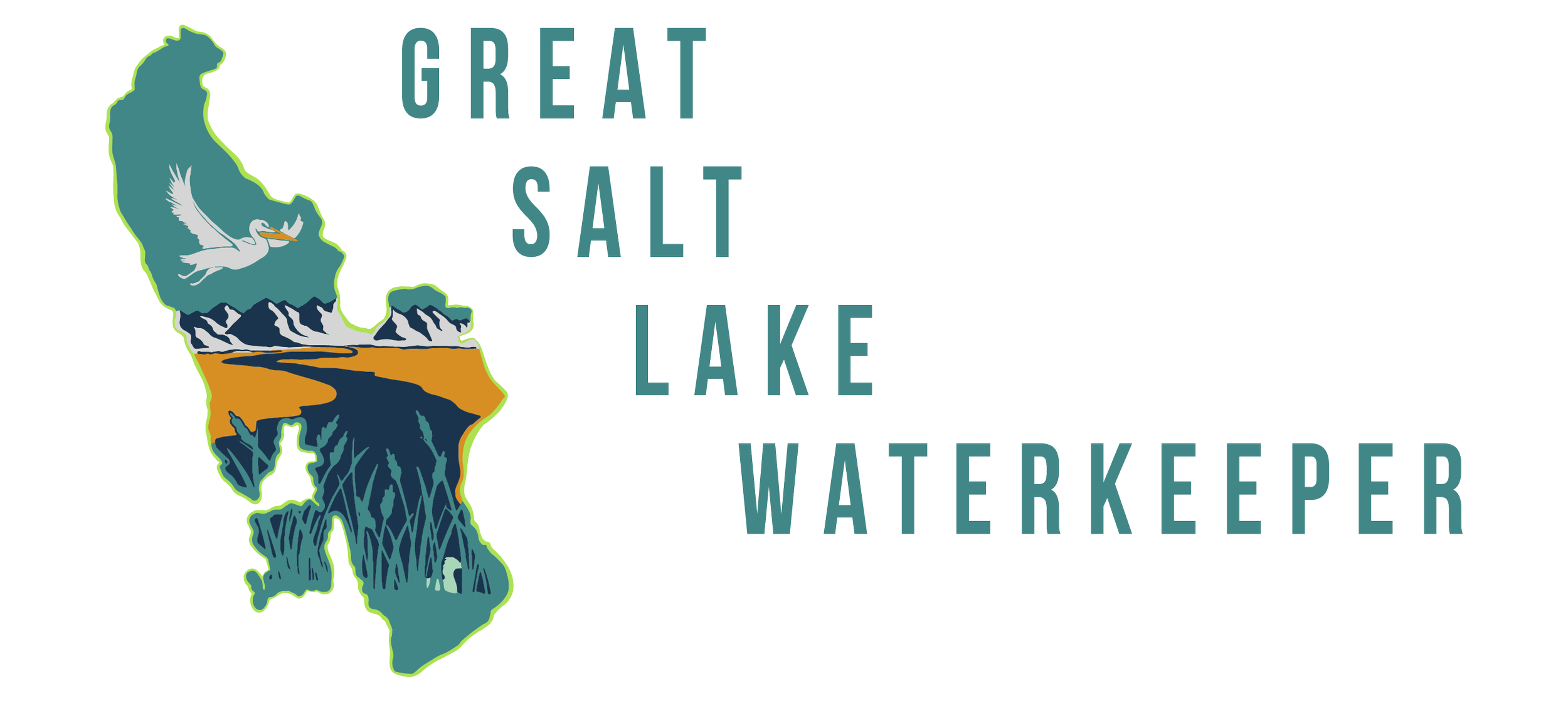
Final Design Concept
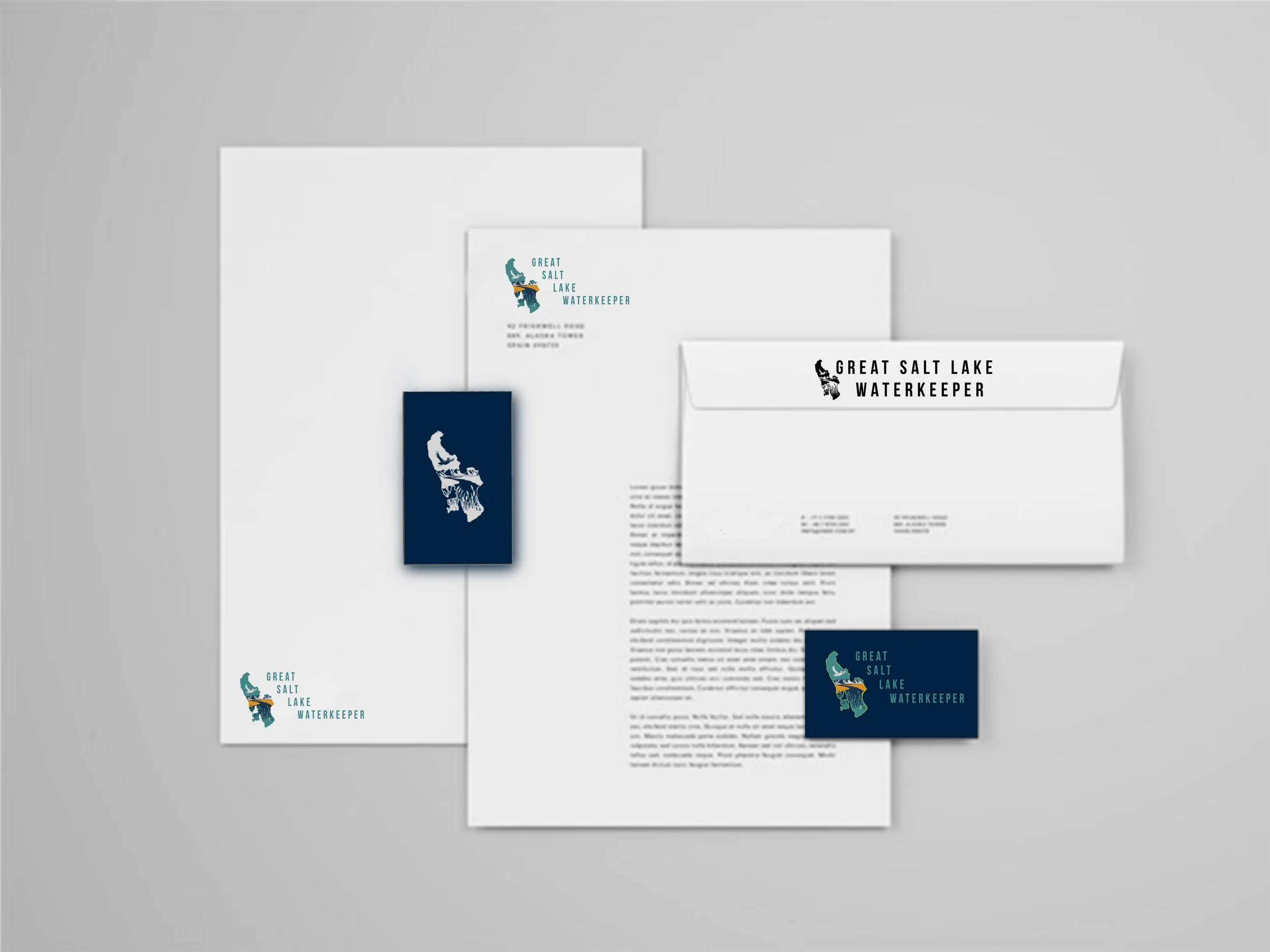
In an effort to simplify the design for many uses, including letterheads ad logos, we paired down some of the design elements, prioritizing the shape of the Great Salt Lake, and the pelican leaving its habitat, and the Wasatch mountain range, which became a bit more binary to capture their essence from a farther range. In the full color version, the grebe can be seen in the bottom through the grasses, and the Bear River is shown more visibly coming from the snowy runoff from the mountains. The color palette was refreshed to maintain the color scheme of the Utah Rivers Council, the source of the Great Salt Lake Waterkeeper Project.
Thanks for making it this far!
I’ve really enjoyed working on this project and I’m always looking forward to feedback, whether it’s good, bad, or in between!
Cheers,
Rita Carr